Sunday, March 31, 2013

Bioshock: Infinite Review

BIOSHOCK INFINITE

(NOTE: My comics this week are coming in on Monday due to a mixup, so my comic reviews will be up much later than usual. So, here's something completely different.)

So, I've been following Bioshock since the 2nd game (but I got the first as a Christmas present a few years ago). I don't play video games that often, with the last game  (that wasn't Bioshock related) that I played was Skyrim. Irrational and 2K announced Infinite about 5 or 4 years ago, and it was delayed three times (you can find a fun little easter egg that references this in Battleship Bay), so as time went by, expectations went up. So I'm glad to say, that Bioshock Infinite kicks ass. And then some.

The story behind Bioshock Infinite is simple: You are Booker DeWitt, a Pinkerton agent with a whole  lot of debt. So, to clear the debt, DeWitt has to go to Columbia, a city in the sky, and rescue a girl named Elizabeth. At first glance, this sounds like something out of a Disney movie, but I assure you, it's not. The story has a lot of twists and turns, and players that previously played the first Bioshock, will be expecting something big, another "Would you kindly?" moment, if you will. And there is one, I promise you that. The ending is truly jaw-dropping, and is sure to disappoint some, but astonish others. The game paints a picture of a very Nationalist world, where the Founding Fathers are worshiped as gods, and Abraham Lincoln is seen as the devil for abolishing slavery. Seriously, near the beginning of the came, you can find a statue dedicated to John Wilkes Booth! What about the villain, though? Comstock is a villain that you learn to hate  right away. As you learn more about him, you find there's more to this extremist than meets the eye. What about Elizabeth? Courtnee Draper does a stand out job of voicing Elizabeth, and the child-like charm the character has gets you attached to her early on. On the game's cover, Booker looks like your average video game protagonist, but as with many other things in the game, he's more than he looks. Booker turns out to be one of the most layered characters in the game, and despite being a thug, he has become one of my favorite characters throughout. Columbia is the complete opposite of Rapture. Columbia is still thriving, and at the height of its Golden Age, where, in Rapture, that boat set sail and sunk long ago (no pun intended).  However, as you venture deeper into Columbia, you find a seedier underbelly, and some grisly secrets that can make  even the most hardened players cringe. Even thought it's not an open-world game, Columbia feels like this massive treasure trove to explore, and does a great job with making the city feel alive, with an attention to detail the size of Skyrim. 

Bioshock Infinite IS still a video game, so how does the gameplay work out? Excellently. Like in the first Bioshock, you have your weapons (though you can only carry around two at a time, which is rather frustrating), and Plasmids-- I mean Vigors. Vigors run on salts which is the Infinite equivalent of EVE. Most of the Vigors are updated versions of the plasmids in the first two games. For example, Devil's Kiss replaces Incinerate!, but instead of just lighting an enemy on fire, you throw a fireball at them.  Another unique feature that Vigors have, are traps, where you throw a trap down, and it unleashes a more powerful version of the Vigor. I really like this concept, as in the first two Bioshock games, I found traps were rather useless. My favorite vigor  to use is  Murder of Crows. My strategy with it is to sneak up on two unassuming enemies, not paying attention to their surroundings, and SUDDENLY MANEATING CROWS. Gear is also new to Infinite, which replaces Gene Tonics. Many of the Gear you can find in the game is awesome, such as being able to melee, and set them on fire, or becoming invincible for a short duration after killing someone from a Sky-Line. Instead of having a wrench as another weapon you can equip and unequip, you have a Sky-Hook, and you can just tap a button, in you whack an enemy in the face. Another feature the Sky-Hook has, is the finisher. Similar to the Pokemon games, when you get an enemy's health low enough, you can finish them. But instead of throwing a Pokeball at them, you snap their neck with the hook, or (even better,) rip their freaking head off. However, my favorite part of the Sky-Hook is the ability to use Sky-Lines. During my first playthrough of the game, I thought the Sky-Line was only good for moving around, and that combat on it was tacky and  nerfed. However, I quickly got used to it, and I began to enjoy just raining bullets on enemies from above. 

Bioshock Infinite is one of the greatest games I have ever played, period. Few games can find the perfect balance between gameplay and story, and Infinite has the best of both worlds. (NOTE: I don't have a system for rating video games, mainly because I'm not going to do this often.) Infinite truly lives up to the Bioshock name, and breaks all the barriers of video games. This is what the future of video games should be.

THE VERDICT: 5/5

Sunday, March 24, 2013

Pull List: 3/27/13


I promise I will upload more reviews next week... I've just been too damn tired.

PULL LIST
I, VAMPIRE #18
by Joshua Hale Fiakov and Scott Clark

Oh, man. I already miss Scott Clark. As we reach the climax of I, Vampire, the ending of #17 made me really anxious for this issue.

JUSTICE LEAGUE DARK #18
by Jeff Lemire and Mikel Janin

I have been very disappointed in the recent "Death of Magic" storyline, but against my better judgment, I'm going to continue to read this series.

BATMAN INCORPORATED #9
by Grant Morrison and Chris Burnham

I still haven't read Batman Inc #8, but I'm going to pick it up digitally before I read #9.

FF #5
by Matt Fraction and Mike Allred

The mystery of Medusa is very intriguing. Who's side is she on? 

GUARDIANS OF THE GALAXY #1
by Brian Michael Bendis and Steve McNiven

I absolutely LOVED #0.1, and of course I'm going to pick it up.

WISH LIST
FANTASTIC FOUR #5AU
by Matt Fraction and Mark Bagley

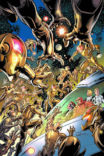
As I say every week, it's just not in my budget. And I'm curious as to how Ultron is going to affect the First Family's adventures.

ANTI-WISH LIST

SUPERMAN #18
by Scott Lobdell and Kenneth Rocafort

To quote "Batman: Under the Red Hood":

Superman: I forgive you for not making me a must-read comic... But why in God's name... 

... IS HE STILL WRITING MY SERIES?

Friday, March 22, 2013

Justice League of America #2 Review

JUSTICE LEAGUE OF AMERICA #2
by Geoff Johns, Matt Kindt, David Finch and Scott Clark

'Murica.

JLA #2 is upstaging the main Justice League series. A lot. Johns does a much better job with characterization here, and the plot is much more interesting. I'm anxious to see what Professor Ivo and albino Alfred have in store. One of the things Johns does good, is that he does a very good job of making some of the less known team members relevant. The Secret Society also prove to be a rather menacing presence, despite barely appearing here. However, whenever the book tries to go for an emotional moment (the scene where Catwoman sympathizes with Steve) is just comes off as cheesy.

David Finch's art looks very gritty, and energetic. The power he gives to the action scenes make them a joy to read, and Sonia Oback's colors look awesome. However, there are times when Finch gives every character the same bored expression, and it comes off as tiresome.

The backup is the highlight of the book. Matt Kindt's story is particularly engaging, but it's Scott Clark's art that makes it achieve the level of awesome it's reached. I'm sad we'll never be able to see any more of his art due to his recent passing, but this is some of his best work besides Brightest Day. I like the dark and shadowy tone it evokes, and the computerized gleen it has.

JLA #2 is already much better than the main Justice League. It has a menacing villain, engaging story, great art, and an awesome backup. Pick it up, for 'MURICA!

STORY: 4/5
+ Good character work
+ The Secret Society is awesome
+ Makes lesser known characters pretty cool
- Fails to deliver emotional moments

ART: 4/5
+ Dark
+ The colors really shine
+ Great looking action scenes
- Characters frequently have the same expression on their face

BACKUP: 5/5
+ Engaging story
+ Some of Scott Clark's best work
+ Very distinct and unique look

VERDICT: 4.5/5

Thursday, March 21, 2013

Constantine #1 Review

CONSTANTINE #1
by Jeff Lemire, Ray Fawkes and Renato Guedes

Still not as bad as the Constantine movie.

Constantine #1 feels like we're just retreading old material. The story is that there's this guy named Chris who's friends with Constantine, and Chris sees magic stuff he shouldn't be seeing. So, Constantine and Chris go on a magical adventure to find this compass thing. This entire issue felt way too much like it was a rehash of the Books of Magic storyline in JLD. And that's rather disappointing, considering Lemire wrote that. I also felt that Sargon the Sorceress is a rather lame villain. On a more positive note, I like how Lemire and Fawkes write Constantine, which is completely different from the scared Constantine in JLD. 

Despite how awesome Renato Guedes's art looks, it doesn't fit the dark tone of the story. I wish they had gone with an artist with a darker tone like Andrea Sorrentino or Frazer Irving. But that's not saying Guedes is a bad artist. He brings a refined sense of detail to the issue, and the colors are rather pretty. But the book isn't meant to be pretty.

Constantine #1 is a disappointing and underwhelming debut from Lemire and company. Though Lemire is killing it on Animal Man and Green Arrow, seems like Constantine is going to be the odd man out.

STORY: 2.5/5
+ Constantine is more Constantine than JLD Constantine
- Predictable and overused plot
- Sargon the Sorceress is Komodo's lamer sibling

ART: 3.5/5
+ Looks pretty
+ Very detailed
- Doesn't fit the grim tone of the story

VERDICT: 3/5

A FEW COMMENTS:
Wait, Zatanna's father was a bad guy? 


Sunday, March 17, 2013

Pull List: 3/20/13


Yeah, in case you're new here, this is my pull list, where I list the comics I'm getting this week, one I want and one I would like to burn with Satan's farts.

PULL LIST
CONSTANTINE #1
by Robert Venditti (or Jeff Lemire?) and Renato Guedes

Wait, who wrote this? Robert Venditti or Jeff Lemire? The preview listed Lemire as the writer, but the Diamond catalog still lists Venditti as the writer... 

DAREDEVIL #24
by Mark Waid and Chris Samnee

For some reason, I always go to Daredevil with low expectations each month, even though each issue is usually freaking awesome.

INDESTRUCTIBLE HULK #5
by Mark Waid and Lenil Yu

Waid and Yu have been killing it on Hulk, but I'm most likely going to drop it soon, because I can't stand Walter Simonson's art.

JUSTICE LEAGUE OF AMERICA #2
by Geoff Johns and David Finch

JLA #1 was surprisingly very good. Let's hope this issue is even better.
SAGA #11
by Brian Vaughn and Fiona Staples

The rally cry of the comic book community of the Internet right now: SSSAAAGGGAAA!

WISH LIST

GREEN LANTERN: NEW GUARDIANS #18
by Tony Bedard and Aaron Kuder

I freaking love Aaron Kuder's art, but my budget refuses to let this in... Especially since I didn't like Tony Bedard's Blue Beetle.

ANTI-WISH LIST

THE SUPERIOR SPIDER-MAN #6
by some guys who hate Peter Parker

... I really hate this series.


Friday, March 15, 2013

Batman #18 Review

BATMAN #18
by Scott Snyder, Andy Kubert, and Alex Maleev

C'mon everyone, sing it with me!

In west Gotham born and raised...

So, Batman #18 is another interlude issue featuring one of my favorite new characters to come out of the DC relaunch: Harper Row. The first part of the issue is very good, with Harper and her brother visiting their father in Blackgate. Then, once Batman shows up, things go downhill. Snyder writes a very bland angry Batman. I mean, it's as if he's just some guy in a costume who likes to yell at people. I also did not like Harper's monologue at the end. In fact, even she acknowledges how corny she sounds. Also, there's nary a mention of Robin (besides the last page, in which a building's light are shaped in a letter "R"), who's death supposedly caused Bats to go over the edge. I mean, for all we know, It could have been the stress from Death of the Family causing Batman to get agitated. This is a very disappointing story from Snyder and crew. 

Andy Kubert's art is thankfully very fluid and dynamic. He draws an awesome Batman yelling at people. However, the art transition between Kubert and Maleev is jarring, but not enough to bring you out of the issue. Maleev's art looks pretty, and gritty, but is in contrast to Kubert's smooth and solid drawings.

Batman #17 is a surprisingly disappointing follow-up to the spectacular Batman #12. Poor Harper deserves a better story than this. And just why can't Batman accept her, even though she's saved his life twice, and kept him from going Bat-$#!@ insane? 

STORY: 2/5
+ Hooray for Harper!
- That monologue is so corny!
- So wait, how can we be sure Batman is angry because of robin's death? 
- Oh man, angry Batman equals boring Batman

ART: 4/5
+ Fluid and dynamic! (Say it with emotion!)
+ The transition between artists is surprisingly not as jarring as you would think
+ Maleev's art is gritty
- Two art styles are in direct contrast to each other

VERDICT: 3/5


Wolverine #1 Review

WOLVERINE #1
by Paul Cornell and Alan Davis

This is not the best book about the best there at what he does.

Paul Cornell... Tsk tsk tsk. I had such high hopes for you. With your spectacular work on Stormwatch, I hoped you could make this a good Wolverine book. But alas, I set my expectations way too high. You know, I thought we had reserved the mindless action book feel for Savage Wolverine. I don't think there's enough room for two when it comes to tour de forces like this. I also felt Wolverine felt a little bit out of character towards the beginning (I mean, why did he look so scared?). I also prefer my books to have a little bit more plot. However, this book does do some things well. I thought Cornell gave us an interesting setup, and it was pretty fun to read.

Alan Davis's art feels like classic Wolverine. He feels like the big brute we're all used to. Yet, many of Davis's facial expressions look contorted, and strange.

Wolverine #1 disappoints, but not on a massive scale. In terms of Wolverine books, I recommend Savage Wolverine over this, as that book at least has better looking art. 

STORY: 2/5
+ Interesting setup
- I'd like a bit more plot, if you don't mind
- Wolverine is slightly off

ART: 3/5
+ CLASSIC WOLVIE! SNIKT!
- Why do some faces look so weird?

VERDICT: 2.5/5


Batman and Robin #18 Review

BATMAN AND ROBIN #18
by Peter Tomasi and Patrick Gleason

"Hello darkness, my old friend
I've come to talk with you again
Because a vision softly creeping 
Planted seeds while I was sleeping
Still remains
Within the sound of silence"

So, Batman and Robin #18 has been getting rave reviews everywhere, left and right. Why? There's a good reason why...

Now, I was very skeptical when DC announced this would be a silent issue. Most of the time, removing the dialogue from a script is just a gimmick. That is not the case here. Tomasi shows us Bruce's decent into darkness in the wake of Robin's death. The silence gives this issue a very melancholic and depressing feeling. Each page feels like a gut punch, with Damian's absence. It feels like you're going over the edge with Bruce, every last step of the way. If you're easily susceptible to tears, I highly recommend not reading this in public, especially the last 4 pages, in which Tomasi and Gleason tear your heart out, and then sucker punch you in the face at the same time. 

The lack of dialogue really allows Patrick Gleason's art to shine. Every panel has some sort of depressing reference to Robin's death. Gleason's skill with capturing emotion is especially tragic, with every last facial expression enhancing the solemn feel. From Bruce's brief and fleeting smile as he imagines Damian sliding down the Bat-Pole with him, to Alfred's simple frown, every page is powerful.

I highly suggest reading this book towards the end of the day, as it will put you in a bad mood for the rest of the day. When a book can do that, you know it's good.

If DC publishes another collection of The Greatest Batman Stories Ever Told, this must be in there. This is more than just a comic, it's a masterpiece, Tomasi and Gleason's magnum opus.

STORY: 5/5
+ Silence is golden
+ Every single page is an emotional gut punch
+ The last four pages will give you a whole case of feels and then some

ART: 5/5
+ Silence lets the art tell it's tale
+ Very emotional
+ Ridiculously powerful

VERDICT: 5/5

Sunday, March 10, 2013

Pull List: 3/13/13

Looks like comics are coming out on a 13th. You know  what that means... Liefeld is writing/drawing a book this week-- Wait, he already did that last week? Oh. OK, so this is my pull list, where I list the comics I'm buying this week, a comic I want, and one that must be ripped to shreds (and then burn the limbs).

PULL LIST
BATMAN #18
by Scott Snyder, Andy Kubert and Alex Maleev

Robin is dead. Now, how long will it be before his body is dumped in a Lazarus Pit? 

BATMAN AND ROBIN #18
by Peter Tomasi and Patrick Gleason

The thing that really surprised me about Robin's death, was that DC was willing to kill off the main character of one of their best-selling titles. For the greedy forces that be at corporate allowing this, how long will it be until hell freezes over?

UNCANNY X-MEN #3
by Brian Michael Bendis and Chris Bachalo

Uncanny X-Men has been surprisingly good. Bendis's writing is almost Ultimate Spider-Man quality, and Chris Bachalo's looks pretty damn good.

WOLVERINE #1
by Paul Cornell and Alan Davis

This better be good. Paul Cornell did the excellent first six issues of Stormwatch, and... I really don't have anything to say about Alan Davis.

WISH LIST
DEATHSTROKE #18
by Justin Jordan and Edgar Salazar


Jordan's Deathstroke run actually hasn't been too bad (I've been flipping through copies at my local shop). My budget just won't fit it in.

ANTI-WISH LIST
AGE OF ULTRON #2
by Brian Michael Bendis and Bryan Hitch

Marvel, PLEASE just stop the damn events already! 


Green Arrow #18 Review

GREEN ARROW #18
by Jeff Lemire and Andrea Sorrentino

Komodo's  daughter is hilariously sick, twisted, demented and horrifying.

Jeff Lemire's Green Arrow has quickly become one of my favorite series. Lemire's Green Arrow changes from the James Bond-esque tone of JT Krul and Ann Nocenti's run to a dark Bourne like thriller. The supporting cast built up by the previous two writers are quickly killed off (except for one) making it feel like Ollie's world is coming down on him. Komodo was a menacing presence in #17, but here he shows a human side. And then he quickly goes back to killing people without hesitating, keeping him from becoming a sissy-villain. Magus is an interesting character, and I'd like to see more of him. There are also a few interesting reveals about the Island in this issue, adding a few extra layers to the cliched origin story. 

Andrea Sorrentino's artwork suits this gritty story, and it feels very different from his I,  Vampire work. Unlike his I, Vampire art, in which he used to shadows to maximize the creepiness, he isn't afraid to  play in the light here. Sorrentino's style of dealing with action scenes is pretty cool as well, where he uses panel borders and monochrome colors to emphasize important parts of the action. The last page looks a little bit strange, but beyond that, Sorrentino does his best.

Green Arrow #18 is the bomb. If Lemire and Sorrentino keep up this level of quality, we'll have a classic Green Arrow story on our hands.

STORY: 5/5
+ Komodo is freaking awesome!
+ Supporting cast utilized well (and then thrown away)
+ Magus seems pretty cool
+ The Island origin story is given a few extra layers

ART: 4.5/5
+ Excellent use of light 
+ Great action scenes
- Last page looks kind of weird

VERDICT: 4.5/5

Saturday, March 9, 2013

Swamp Thing #18 Review

SWAMP THING #18
by Scott Snyder and Yannick Paquette

Is it just me, or is it weird that the Parliament of Rot look the most human out of all of the characters in this issue?

Swamp Thing #18 is the big finale to Scott Snyder's Swamp Thing saga, and it has been worth it. It's worth suffering the emotional ups and downs (and critical ups and downs) Snyder and Paquette made us endure. The big fight between Swampy and Abby, and Arcane is brutal yet satisfying, and when Alec is forced to kill Abby, it's hard to read. Thankfully, Snyder finishes it off on a happy note, and we're left with an excellent ending to his entire run. However, the same problem I had with Animal Man #18 is here, as it quickly retcons everything to happen in Rotworld.

Yannick Paquette's ability to capture emotion is amazing, as it heightens the tragic and happy feel of the book. I really like looking at the complex layouts he uses for his pages, though they can be hard to follow.

Swamp Thing #18 is an emotionally charged finish to Scott Snyder's saga. The ending will leave you satisfied, yet wanting more. Pick this up.

STORY: 4.5/5
+ Excellent character work
+ Very emotional
+ Satisfying conclusion
+ Lots of "D'aawww!" moments
- Makes Rotworld completely useless

ART: 4.5/5
+ Captures emotion very well
+ Heightens the tone of each scene
+ Unique panel layouts look pretty
- Unique panel layouts look confusing

VERDICT: 4.5/5

Friday, March 8, 2013

Animal Man #18 Review

ANIMAL MAN #18
by Jeff Lemire and Steve Pugh

It's nice to see Buddy is bringing out his inner Darth Vader on the cover. "NOOOOO!"

Animal Man #18 is one of the most interesting issues of Animal Man yet. #18 drops Buddy back off at the farm, where Maxine is about to give herself up to the hunters. It's nice to see the emotion that made the first part of the series worth reading is back, along with the sense of dread Rotworld lacked. Speaking of Rotworld, this book completely makes Rotworld irrelevant, and retcons everything that happened in it. I mean, I thought Rotworld was building up to something that would have a long lasting impact on AM and SW, but it didn't. But the end of this issue WILL rock long time Animal Man fans for many weeks to come, with its emotionally charged ending, finally giving Cliff a time to shine. And the entire revelation about the Hunters, boy, the storyline revolving around that is sure to be a doozy.

Steve Pugh's art gives this issue a very Vertigo-esque feel, recalling the tone of Alan Moore's Swamp Thing, and Peter Milligan's Shade. It seems stiff at times, but for the most part it works. Pugh really brings out his inner artist for the last two pages, and contributes a lot to the tragic gut punch. 

Animal Man #18, while imperfect, is a great conclusion to the Rotworld saga, and the final two pages show us that Lemire and Pugh know how to kick your heart in the ass.

STORY: 4/5
+ The emotion of the first couple of issues is back
+ Woah, woah, woah, I did not see the Hunters reveal coming
+ Dem last two pages...
- Makes Rotworld absolutely useless

ART: 4/5
+ Classic Vertigo feel
+ Works  well
+ Makes the last two pages even sadder
- Feels stiff at times

VERDICT: 4/5


Before Watchmen: Rorschach #4 Review

BEFORE WATCHMEN: RORSCHACH #4
by Brian Azzarello and Lee Bermejo

To quote Reed Richards from The Ultimates #1: "How can you stand the disappointment?"

Before Watchmen: Rorschach #4 is not very good. For one thing, Rorschach doesn't feel like the brutal force of nature he was in the original book. The conclusion to his war on Rawhide ends in a stupid way. And the BARD? Don't even get me started on him. First things first: The script is wrapped up in a very confusing and cluttered way. Azzarello tries to juggle the scenes of Rorschach getting trapped in Rawhide's club, Rawhide out on the streets doing criminal stuff, and the waitress (I already forgot what her name was) getting attacked by the Bard. The way it cuts around is confusing and jarring. Even worse, we don't even get a decent conclusion to the Bard mystery, as we don't even find out his real name! HE WAS USELESS THROUGHOUT THE ENTIRE SERIES, AND COULD HAVE BEEN DROPPED ENTIRELY!

The only thing making this issue worth keeping is Lee Bermejo's gorgeous art. He excellently captures the grim and grit of the city, and captures action very well.

Before Watchmen: Rorschach started out as a very promising series, but now, it's quickly deteriorated into a pile of junk and waste of an artist's talent.

STORY: 1/5
-Rorschach not "Rorschach" enough
-Confusing and cluttered
- What ever happened to the Bard?

ART: 4/5
+ Looks absolutely beautiful
+ Great looking action scenes
+ Gritty

VERDICT: 2.5/5

Sunday, March 3, 2013

Pull List: 3/6/13

Once a week, comes the magical day that reminds us: "Oh, that's why I need to get through Monday and Tuesday". The day, that makes up for the dull life we have to live the rest of the week. That day, is WEDNESDAY, new comic book day! Which is sadly two days away. So, this is where I account for the books I'm buying this week, one book I want this week, and a book that you couldn't pay me $1,000,000,000 to read. So, let's begin!

PULL LIST
ANIMAL MAN #18
by Jeff Lemire and Steve Pugh

Though there was no actual tragedy in Rotworld, I got a bad feeling about this issue (mainly because of Jae Lee's spectacular cover). 

SWAMP THING #18
by Scott Snyder and Yannick Paquette

Scott Snyder and Yannick Paquette's final issue of Swamp Thing is finally here. Did Abby survive Rotworld? Despite how much I was disappointed, the earlier issues of the series were excellent, especially #10 (the one that Francesco Francavilla drew).

STORMWATCH #18
by Peter Milligan and Will Conrad

The Engineer is a !@#$ing !@#$!@#$ that deserves to be !@#$!@#$!@#$!@#$!@#$!@#$!@#$!@#$!@#$!@#$!@#$!@#$!@#$ with a sharp stick, and then !@#$!@#$!@#$ with a burning !@#$!@$ and then shot in the face.

GREEN ARROW #18
by Jeff Lemire and Andrea Sorrentino

I've been waiting for this. Green Arrow #17 was one of the best comics to come out of the year so far, and let's hope #18 is of the same quality.

BEFORE WATCHMEN: RORSCHACH #4
by Brian Azzarello and Lee Bermejo

Just for this month (and possibly the next, due to the $7.99 issue), I won't be picking up Detective Comics. For one thing, I freaking couldn't get Batman Incorporated #8 (I'm so pissed off!), so I'm delaying getting any Bat-books until the second printing. And, Rorschach, despite how lackluster #3 was, is a series I'd like to see the end of.

WISH LIST
DETECTIVE COMICS #18
by John Layman and Jason Fabok

(Strained) Must... Not... Buy... Haven't... Read... Batman Inc... #8... yet...


ANTI-WISH LIST
YOUNGBLOODS #who cares
by Rob Liefeld, the guy nobody likes

(Rob Liefeld) 


FF #4 Review

FF #4
by Matt Fraction and Mike Allred

This has got to be the weirdest cover I've seen in a while.

Matt Fraction tells this short standalone story revolving around the Moloids trying to keep  She-Hulk from hooking up. Who do they go to for help? Bentley, of course! The result of their escapades are hilarious. This is one of the funniest comics I've read in a long time, as Fraction barely gives the main plot about taking down Doom any attention. Fraction understands the large cast's many personalities, and uses them to the book's advantage. He makes each student of the FF seem important, even Alex. My only problem with the book is the lack of the Doom plot, as the last issue made it seem like it's really important. 

Mike Allred's art lags a little bit in this comic. His signature style is here, and does a great job with the many scenes in Jen's date. His style is crucial in the book's humor. The thing is, he frequently screws up on facial expressions in this issue. Sometimes he makes characters look creepier when they're not supposed to be, or not as strong as the script says they are.

I'll be honest, my expectations for this issue were lessened when I saw the weird cover, but it turns out, I was in for one of my favorite chapters of FF so far. Be warned, the Doom plot takes a backseat, but if you like humor with your comics, you'll love FF #4.

STORY: 4.5/5
+ It's just so funny!
+_Great handle on the large cast
+ Intriguing cliffhanger
- Whatever happened to Doom?

ART: 3.5/5
+ Very energetic
+ Fits the script (for the most part)
- Weird faces

VERDICT: 4/5

Saturday, March 2, 2013

Guardians of the Galaxy #0.1 Review

GUARDIANS OF THE GALAXY #0.1
by Brian Michael Bendis and Steve McNiven

Oh my God. Tony Stark is the new Wolverine. He's in the Avengers, the New Avengers, and now freaking this? Oh my god, what next? Iron Man cereal?

Guardians of the Galaxy #0.1 tells the origin story of Peter Quill, aka Star Lord, leader of the Guardians of the Galaxy. Being completely new to this property, I was pleasantly surprised by this issue. I was never a fan of the team, so I have no idea how much liberty Bendis is taking with this. However, this was a very good issue. It's akin to the first 8 minutes of "Up", as it quickly gets you acquainted with the characters. Over the course of 5 pages, Bendis tells a much better love story than Twilight. Bendis breaks your heart, rebuilds it, and breaks it again over the course of the entire issue, and that's amazing. I think this is thanks to the relatable and realistic characters being written. My only problem with the writing, is well... Tony Stark. He's everywhere. I mean, if they wanted to make the Guardians popular, couldn't they have used another big character? I mean, I would think Nova would be better on the team. 

Steve McNiven's art looks great. I dig the look he's going for here. He perfectly captures the adventurous feel of the book. It doesn't feel stiff like his Civil War work, and the colors aren't weird like his Nemesis stuff. McNiven does a great job with the emotional scenes, but sometimes his characters look a little too strange.

Guardians of the Galaxy #0.1 was a surprisingly great issue. I think the upcoming film should model at least part of it off of this absolutely awesome book.

STORY: 4.5/5
+ Tells a better love story than Twilight in 5 pages
+ Great characters
+ A great character introduction
- Iron Man doesn't belong here

ART: 4.5/5
+ Captures the adventurous feel
+ Does a good job with the more emotional scenes
- Characters sometimes  look weird

VERDICT: 4.5/5

Friday, March 1, 2013

I, Vampire #17 Review

I, VAMPIRE #17
by Joshua Hale Fiakov and Fernando Blanco

"Andrew Bennett. You killed my father. Prepare to die."

Yup, the climax of I, Vampire has finally arrived. The penultimate issue. Where a bunch of characters get killed off, and Tig makes a "The Princess Bride" reference. Fiakov grounds all of his characters in reality, despite their supernatural powers. Also, I did not see the massive death that happened in the end. I really like Andrew Bennett as a villain, which makes him a much more interesting character. 

Fernando Blanco is an excellent replacement for Andrea Sorrentino. For once, an artist that emulates Sorrentino, yet somehow making the book his own. He still manipulates the shadows, while making it a bit easier to read. However, it doesn't have that unique ting that made Sorrentino's art so great.

I, Vampire #17 is finally a great issue after Andrea Sorrentino's departure. It was just amazing.

STORY: 5/5
+ Andrew Bennett is better as a jerk
+ Realistic characters
+ "You killed my father. Prepare to die."

ART: 4/5
+ Feels like Sorrentino
+ Blanco still makes it his own
- Doesn't have the unique ting that Sorrentino has

VERDICT: 4.5/5

Uncanny X-Men #2 Review

UNCANNY X-MEN #2
by Brian Michael Bendis and Chris Bachalo

That was not what I was expecting. Not at all.

So, Uncanny X-Men picks up just a few hours after UXM #1. Magneto is still an out-of-character hypocrite, and Cyclops and Emma Frost have a surprisingly interesting conversation in the beginning. Bendis has a much better handle on each of his characters than the last issue, and even fleshes out minor characters such as the kid that makes... (*tries not to laugh*) massive golden balls fly out of his body. I really like where Bendis is trying to bring his plot, and I'll admit, the ending has my fanboy blood pumping. 

Chris Bachalo does a better job of differentiating his female characters in this issue. His exaggerated, cartoonish style fits the book excellently. However, I did not like the  fact that he frequently uses blank spaces as his backgrounds. It just makes him seem lazy at times.

Uncanny X-Men #2 shows us that Bendis can give us a good book when he wants to, and that Chris Bachalo is a ridiculously talented artist.

STORY: 4/5
+ Characters seem  more  like themselves
+ A very memorable exchange between Cyclops and Emma
+ MASSIVE GOLDEN BALLS!
- Magento is still out-of-character

ART: 4/5
+ Fits the book's tone perfectly
+ Very stylized
+ Female characters actually  look different from each other
- Blank backgrounds tend to be frequent

VERDICT: 4/5