Sunday, September 30, 2012

Judging a Comic By It's Cover: 10/3/12

Here we are on Sunday again. If you don't know the drill, these are my picks for Cover of the Week, honorable mentions, and worst cover of the week out of this week's Diamond releases.

COVER OF THE WEEK
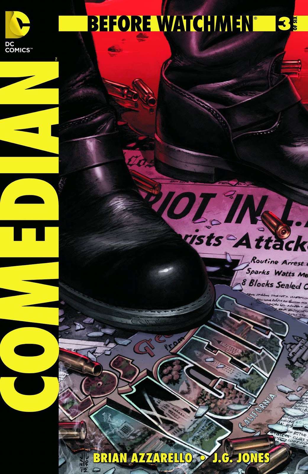
BEFORE WATCHMEN: RORSCHACH #2
by Brian Azzarello and Lee Bermejo
Cover by Lee Bermejo
Holy cow. Unfortunately, I can't stop there, because this  cover is just too good to pass up. If you're not buying this book because Rorschach isn't your favorite Watchmen character, get it for the art. It's some of the best on the shelves, period. There are so many tiny details to appreciate, you'll need to look at it again. A recurring theme throughout the Before Watchmen books I've noticed are eggs. It showed up in Minutemen #2, the preview for Nite-Owl #1 and now here. What's up with that?

HONORABLE MENTIONS
ANIMAL MAN #13
by Jeff Lemire and Steve Pugh
Cover by Steve Pugh
This isn't exactly an Animal Man cover. It's a Walking Dead cover. If the  zombified Hawkman wasn't creepy enough, (At least he's broken free of Liefeld) the setting of the wasteland zoo amps up the fear factor to  11. The only thing that kept  me from choosing this as cover of the week was that Animal Man's torso looks a little bit out of proportion. 

MINIMUM CARNAGE ALPHA #1
by Chris Yost and Lan Medina
Cover by Clayton Crain
This is how a team-up cover is done. However, I'm only choosing this for how AWESOME Carnage looks, riding a syringe. Your arguments are all invalid.

THE DEFENDERS #11
by Matt Fraction and Mirco Pierferderci
Cover by Terry Dodson
Terry Dodson wins again! If DC has Ryan Sook,  MARVEL has Dodson. I love the energy Dodson brings to the cover with his Adam  Hughes like style. It's just... Why is no one attacking the big monster blowing up the city?

WORST COVER OF THE WEEK
PATHFINDER #2
by Jim Zubkavich and Andrew Huerta
Cover by Lucio Parillo
POUCHES!

Saturday, September 29, 2012

American Vampire #31 Review

AMERICAN VAMPIRE #31
by Scott Snyder and Rafael Alberquerque

If you haven't been keeping up with American Vampire (I have in trades from my library), shame on you. This issue was amazing.

Scott Snyder has crafted a nice read with American Vampire #31. It's a vampire book with blood, but  relies heavily on the small emotional moments. The scene of Pearl and Henry in the hospital is a great piece of character work, and I would have enjoyed it, even if the entire issue (heck, maybe the entire arc) revolved around that moment. It's just great. Snyder then moves into an action scene that kind of comes out of nowhere and has Skinner Sweet pull a cliched action movie stunt, having him go solo. Besides that, Snyder has come close to perfection,

On the  other side of the lines, Rafael Alberquerque's art is some of the best work I've seen from him. It keeps the book (somewhat) from getting too dark, without being cartoony. It's  a little sketchy, but I don't really mind.

American Vampire is an astonishing series, that deserves to be a TV show as much as The Walking Dead. Despite some small nitpicking, this book is a  great example of Scott Snyder's writing skills.

STORY: 4.5/5
ART: 5/5
VERDICT: 4.5/5

I, Vampire #0 Review

I, VAMPIRE #0
by Joshua Hale Fiakov and Andrea Sorrentino

Last month's I, Vampire  was a thing of beauty. Though the art was way too shadowy, it was still a spectacular comic book. I,  Vampire #0 switches gears after last month's MASSIVE game changing ending, as we learn Andrew Bennett's origin.

Fiakov continues to have a good handle on his characters. While Andrew's origin isn't anything that reinvents the wheel, Fiakov  still makes this a fun read. His dialogue style changes here to follow suit with the setting change, with a Victorian style instead of his usual modern style, full of pop culture jokes. One  small quibble: As with many of the other #0 issues, this issue is just filler. Fiakov does not utilize this space to progress this story or provide further insight into what happened. And that's a major bummer, because according to the December solicits,  Cain is the only one who can help Andrew, and I wish this issue showed why.

Sorrentino's art is freaking creepy. The brutal chase scene through the woods absolutely REQUIRED Sorrentino's style, and his unique method of shadowing doesn't bother me anymore  now that I am used to it.

If you don't mind this being filler, I, Vampire #0 is an entertaining read, despite not reaching its full potential.
STORY: 4/5
ART: 4/5
VERDICT: 4/5

Friday, September 28, 2012

Justice League Dark #0 Review

Justice League Dark #0
by Jeff Lemire and Lee Garbett

Has Justice League Dark improved from issue 12? Or is the series continuing its downward trend? 

Anyone who was as disappointed with issue 12 can take a breath of fresh air. I am happy to say that Lemire has returned to the fun and creepy tone of issue 9 instead of the boring standard superhero fare of issue 12. Many writers have not been taking advantage of the 0 issues, but Lemire uses full potential of a flashback, which even reveals the identity of the mysterious man who is looking for the Books of Magic. Lemire also digs into Constantine's history with Zatanna, and shows us a very different side of Constantine. Lemire tells a heartbreaking story about how Constantine betrayed his mentor, and put him on the path to being the b@stard he is today.

While the writing improves, the art... is by a fill-in artist. Now, Garbett was a frequent collaborator with Grant Morrison, on the last chapter of "The Return of Bruce Wayne", and does a good job with the book. It's just, his style doesn't fit the book. It's way too cartoonish and upbeat for it. Not that I don't like, I love it actually. I just got sucked out of the story in some places.

JLDark is back on track with issue 0! I'm excited to see where Lemire takes us  next on the journey of the team! Note: I love how Lemire  is one of the only writers who have made the 0 issue crucial to the current series arc.

STORY: 5/5
ART: 2/5
VERDICT: 3.5/5

Talon #0 Review

Talon #0
by Scott Snyder, James Tynion and Guillem March

Calvin Rose is trying to live a normal life, but he can't because he's being hunted by the Court of Owls! Does Talon #0 manage to craft a good origin and an interesting character? Or does it succumb to the cliched "My parents are dead!" origin and a 2 dimensional character?

It gives me great pleasure to say that Talon is one of the best books I've read this month. Keep in mind, that Scott Snyder is only co-plotting the book. The writing is mostly being helmed by James Tynion, the co-writer of the backup stories in Batman. Earlier this month in Batman #0, Tynion upstaged Scott Snyder with his spectacular backup about the Robins. Tynion continues being AMAZING here in Talon #0, where he creates an origin that manages to make you think. Calvin Rose is a surprisingly interesting character, who struggles to get over the fact that he killed someone. Tynion makes you wonder whether or not the Court of Owls is justified in their mission to "devour" their enemies and criminals. Why? The Court kills both, standard criminals and the innocent people that stand in their way, including children. Do they have the right to kill civilians that oppose what they do, despite how noble their motives are? I also applaud Tynion for writing a GOOD origin for Rose, though it's not great. It strays from typical superhero origin fare, but it doesn't separate itself from the pack that much. The escape sequence is truly intense, and you actually doubt Rose's survival.

Guillem March's art is perfect for this book. He uses a creepy style that slightly mimics that of Frank Quitely's, but puts in a personal touch. March succeeds the most in facial expressions, all conveying the emotions the characters feel, flawlessly.

Talon is an AMAZING book, and my pick for the best comic of the week.

STORY: 4.5/5
ART: 4.5/5
VERDICT: 4.5

Batman Inc #0 Review

BATMAN INC #0
by Grant Morrison, Chris Burnham and Frazer Irving

Batman Inc #0 tells the story of how Batman assembled the members of his global war on crime. So, is this a great new addition to a great series that treads on new ground or is it just a rehash of the amazing Batman Inc #6 (2011)?

Morrison makes Batman Inc an incredibly fun read, and (surprisingly), unlike his past works, it is not confusing at all. It is a straight forward story and it does what it sets out to do spectacularly. I, in particular, love Morrison's sense of humor. This issue is very lighthearted and filled with a lot of funny back and forth dialogue. The book introduces a lot of new elements into the book, such as a possible romance between Squire and Dark Ranger, and the tale of how Batman recruited the Batman of Russia (before he was DISSOLVED of his duties in Batman and Robin #1). My only problem with the book is that Morrison is basically retelling the story from Batman Inc #6.

I loved Frazer Irving's work in the "Return of Bruce Wayne" a few years ago. Unlike most people, I even enjoyed his work on "Batman and Robin Must Die". His work here is very hit or miss. When Irving misses, his work looks rushed, ugly, and his facial expressions need a LOT of work. When he hits, he delivers in spades, with beautiful compositions, colors, and atmospheric art. Two panels of note: The opening explosion scene and one of Batman and Dark Ranger illuminated in the headlights of a car.

Batman Inc #0 is a fun book. I absolutely loved reading every page of it, no matter how bad the art or writing is. However, one thing has changed from Batman Inc #6. The theme of Batman Inc #6 was crime and Batman are mirrors. Here, it is Batman is never alone in his war. And the book does a great job of enforcing it.

STORY: 4/5
ART: 3/5
VERDICT: 3.5/5

Sunday, September 23, 2012

Judging a Comic By It's Cover: 9/26/12

Welcome to another weekly Judging a Comic By It's Cover column! In case you don't know, I pick 1 cover of the week, 3 honorable mentions, and 1 worst cover of the week. Now off we go!

COVER OF THE WEEK
CAPTAIN AMERICA AND BLACK WIDOW #637
by Cullen Bunn and Francesco Francavilla 
Cover by Francesco Francavilla
OK, this cover is just downright creepy. The shocked expression and Cap and BW's faces are priceless, while the Avengers in the test tubes are so lifeless, to the point where it's almost scary. None of them are struggling, not even Hulk. That's got to be pretty terrifying alone.

HONORABLE MENTIONS
NATIONAL COMICS: ROSE AND THORN #1
by Tom Taylor and Neil Googe
Cover by Ryan Sook
Ryan Sook is going to be the next Adam Hughes. Not only is his style almost an exact imitation of Hughes, but it still feels like his own. This cover is a gorgeous display of that. The level of detail in the room is immense. The creepy smile on the girl in the mirror is pretty frightening. Even Sook's entire idea of displaying the two personalities that inhabit Rose's mind is pretty interesting too. He plays on the idea of the different reflections in the mirror concept, and twists it a bit, by showing the weapons in the closet. It's not something you expect to find in a regular teenage girl's room. 

ULTIMATE COMICS: THE ULTIMATES #16
by Sam Humphries and Luke Ross
Cover by Michael Cormack
Captain America is the new President of the United States. A better choice than Obama. Political joke aside, I really like the idea of Cap as president, and what better way to show that, than with a painting of Cap taking the oath? The painting style Cormack uses here is pretty freaking impressive. At first glance, I actually thought this was a photograph, until I saw Cormack listed as cover artist. And that's awesome.

DEADPOOL #61
by Daniel Way, Salva Espin and Ale Garza
Cover by Dave Johnson
A monkey assassin. A MONKEY. ASSASSIN. That's the only reason this is here.

WORST COVER OF THE WEEK
GODSTORM #0
by Joe Brusha 
Cover by Eric Basaldura
For a god, he's so short.

Friday, September 21, 2012

DAREDEVIL #18 REVIEW

DAREDEVIL #18
by Mark Waid and Chris Samnee
 
In the shower this morning, I had a little thought. Marvel should stop throwing it's money at events and wasting their talent on Summer events just to boost sales up a little bit, and instead focus on cranking out good series like Mark Millar and Dave Gibbon's the Secret Service, or DAREDEVIL.
 
After being booted out of their law firm, Matt Murdock gets a call from Foggy, asking to look into the mysterious murder of one of his client's sister's boss (whew). Even more shocking, Matt comes home to his apartment, and finds his crazy ex-wife on his bed. So, Matt and Foggy make a trade. Matt looks into Foggy's case, while Foggy solves Matt's crazy problem. As DD attacks the guards of the prime suspect, the prime suspect falls down an elevator shaft and dies. This then leads to a cliffhanger for the subplot, which is even crazier than the main story. The thing I like most about this issue, is Waid's ability to balance character and plot. Waid shows us, that even when these two best friends are out odds, no matter how extreme, they still end up helping each other. The dialogue in this issue is top notch as well. For example, the now bitter and angry Foggy mocks his client ("I-I-I have no money!" "Yeah, well I-I-I have no choice."). Waid shows us how the split between the pals has affected Foggy, while Matt tries to hide his true feelings with his new happy-go-lucky demeanor. Points to the series for giving it a light-hearted feel as a breath of fresh air, among all of the doom and gloom series out nowadays.
 
Accompanied with Waid's amazing story, is Chris Samnee's clean yet drop-dead gorgeous art. Samnee uses light and simple pencils that recall old Steve Ditko art, and the book only improves for it. Samnee's artwork is crucial to the story, with Matt's new positive outlook on life challenging the dark and murky tales of today.
 
Daredevil #18 is worth your money. And yes, I know, a few weeks ago I was writing a rant on Marvel, and I'm giving this a better review than Batman #0, but this book is just that good.
 
STORY: 5/5
ART: 5/5
VERDICT: 5/5

BATMAN #0 Review (And Only One Week Late!)

BATMAN #0
by Scott Snyder, Greg Capullo, James Tynion, and Andy Clarke
 
Uh, yeah. For the first time ever, I think that Scott Snyder has disappointed me.
 
So, the setup to this issue doesn't sound too bad. It's one of the first few nights of Bruce's crime fighting career. Then he tests out a few gadgets. This isn't really the story you get with this issue. The issue starts with a pretty harrowing robbery sequence, reminiscent of the opening of Christopher Nolan's "The Dark Knight". Sadly, it's all downhill from there. After that, Bruce meets Commissioner Gordon on a rooftop, testing out a Batarang, and they have a particularly uninteresting conversation. That scene is then followed by A CLIFFHANGER, when all of the #0 issues are supposed to be standalone stories. This entire issue felt like a waste of space. It was all just to build hype to the upcoming "Death of the Family" arc, and it didn't even do a good job of it. Snyder still manages to nail the voices of the character right, and even gives the Red Hood the dialogue that is just a few steps away from becoming the Joker's. But that's the only good thing about it.
 
However, I can't solely blame Snyder for everything. Greg Capullo's art doesn't seem to be as detailed or good looking as usual. His expressions look rushed, and his facial expressions have a slightly rougher look to them. I prefer Capullo's more cartoony style to this sketchy/hurried one.
 
Thankfully, the backup of the issue, written by James Tynion with art by Andy Clarke is better than the main story. Tynion is able to tell a great story about the night the Bat Signal first lit up, and how it affected the future Robins (and Batgirl) in 4 short vignettes. Tim's and Jason's stories stand out among the pack. The 4 different shorts show how brutal and satisfying crimefighting in Gotham can be. Even Dick's scene is a nod to the original Nightwing costume. It even foreshadows his origin in a quote that a Nightwing fan will recognize ("We'll be performing for Bruce Wayne himself on Saturday! Isn't that cool?"). Somehow, even Andy Clarke (who drew the last 10 pages of Batman #12 last month) is able to stay up to par with his usual detailed work. His hair-thin lines of shadowing, and the high amount of detail are all present here, unlike Capullo's work, which does not look as good as usual.
 
So, Batman #0 is not worth your time or money, unless you want to fork over $3.99 for a good 10 pages. Plus, I'm going to try adding the BACKUP story as its own separate rating category for this issue's verdict.
 
STORY: 2/5
ART: 2/5
BACKUP: 4/5
VERDICT: 3/5

Sunday, September 16, 2012

JUDGING A COMIC BY IT'S COVER: 9/19/12

It's Sunday again, and as usual, here are my picks for Judging a Comic by It's Cover! If you don't know the drill: Every Sunday, I pick one cover of the week, 3 honorable mentions, and 1 worst cover of the week. Now let's get to it!


COVER OF THE WEEK
 
DAREDEVIL #18
by Mark Waid and Chris Samnee
Cover by Paolo Rivera
And for the second week and counting, Marvel's covers have beaten out DC's horrible Zero Month covers for Cover of the Week! What really makes this cover astonishing though, is how Paolo Rivera's only uses these three colors (Black, red and white) to make such an amazing pin-up. I also give Mr. Rivera props for making DD's nervous system so detailed.
 
HONORABLE MENTIONS
BEFORE WATCHMEN: NITE-OWL #3
by J. Michael Straczynski and Andy Kubert
Cover by Chris Samnee
Another simple, yet effective cover. Readers are drawn in, wondering why Nite-Owl is beating down on Rorschach. My only complaint is... What is Archie doing in the background?
 
BATWOMAN #0
by JH Williams and W. Haden Blackman
Cover by JH Williams
Leave it to JH Williams to make the ONLY good #0 cover for DC. Here, Kate looks absolutely gorgeous. The colors really make this picture jump off the page, and the cape is stunning and flowing (Groan!) with detail.
 
LOBSTER JOHNSON: CAPUT MORTUUM #1
by Mike Mignola, John Arcudi, and Tonci Zonjic
Cover by Tonci Zonjic
As with Chris Samnee's Nite-Owl variant, we get another pulp mystery homage from Tonci Zonjic! If not for Daredevil, this would be my pick for Cover of the Week. This cover is the reverse of the old Detectie Comics covers in the 30's and 40's, with Batman towering over wherever his next adventure was. I think this works great, because the fact that the city is a part of Lobster Johnson seems to be a metaphor for his relationship with the city. It's a part of him.
 
WORST COVER OF THE WEEK
CATWOMAN #0
by Ann Nocenti and Adriana Melo
Cover by Guillem March
Catwoman: "I think my spine just snapped."


Friday, September 14, 2012

TEAM 7 #0 REVIEW

TEAM 7 #0
by Justin Jordan and Jesus Merino

Team 7 #0. This was the only new series of DC's Third Wave I was truly anticipating. I would have LOVED to see Grifter, Deathstroke, and Black Canary all on the same team together. That, paired with the fact this was going to be a huge action book made me excited for this. Sadly, I placed my hopes way too high.
 
In the foreseeable future, if the book gets more exciting, this could be DC's very own Expendables. But for now, it's more of just... Some guys with guns in a book that happens to take place in the DCU. Jordan doesn't differentiate the many characters of the book much. Each of them are all stereotypical action heroes, with Grifter being the jerk who's always getting into fights, Deathstroke, the "I can't get close to anyone because bad things happen to them"/bad past guy, Black Canary, a character who doesn't even seem to have a personality cut out for her yet, and many others. The plot of the book doesn't fare well either. It's just John Lynch getting the team together to combat the growing metahuman presence in the DCU. Yeah. However, I commend Jordan (or whatever editorial interference caused this) by mentioning Brother Eye from OMAC and (what I think) is a reference to SHADE. This shows DC's growing concern in connecting each of their different series in a way I don't think any other shared universe has before.
 
Jesus Merino's art goes for a 90's Jim Lee or Dan Jurgens style, and for the most part, I think it works. Merino is responsible for all the explosions, gunshots, and action, and does a spectacular job. My only complaint is that sometimes, he really seems to try to get a 90's style, to the point where his work just doesn't look as detailed as it was earlier in the book.
 
Overall, I can't recommend Team 7 #0. It has it's shining moments with art, but the story doesn't even play like a good parody of 80's action movies. It actually succumbs to the cliches without realizing it, and the art sometimes falters a little bit. Don't pick up this book.
 
STORY: 1/5
ART: 3/5
VERDICT: 2/5

Sunday, September 9, 2012

Judging a Comic by Its Cover: 9/12/12

Welcome to another JUDGING A COMIC BY ITS COVER column, 2 people that read this blog! Here are my picks for Cover of the Week, honorable mentions, and worst cover of the week. So without further ado, here we go!

COVER OF THE WEEK
 
ULTIMATE COMICS: X-MEN #16
by Brian Wood and Carlo Barberi
Cover by Dave Johnson
You don't see many original covers nowadays, which is why this cover is such a breath of fresh air. The red border that forms the X that surrounds the characters, along with Nick Fury blending in with the bottom are all reasons I chose this cover. The X seems to point to the characters in the middle, directing readers' attention towards them. I've never seen something like this. The contrasting colors here are nice as well.
 
HONORABLE MENTIONS
 
BEFORE WATCHMEN: THE COMEDIAN #3
by Brian Azzarello and JG Jones
Cover by JG Jones
As you can tell from my past "cover" columns, I really enjoy simple covers. This cover is simple at first glance, but as you look closer at it, what is going on above the Comedian's feet is revealed. The LA postcard shows the location, and the newspaper and bullets imply that he's in the middle of controlling a riot. Even the blood puddle tells us something about the character, by showing us his ruthlessness.
AMERICAN VAMPIRE: LORD OF NIGHTMARES #4
by Scott Snyder and Dustin Nyugen
Cover by Dustin Nyugen
This is a brutal cover. He's already brought his axe hacking tendecies to the room, but the shadow seems to say that things are just going to get worse.
 
HOAX HUNTERS #3
by Michael Moreci, Steve Seely, and Alex Medellin
Cover by Ryan Brown
Looks like Mr. Ryan Brown has taken a page out of DC's Animal Man! This is a really creepy image, and the fact that the animals are spitting blood alone is going to give me nightmares. However, the colors look great, and the white that envelopes the animals compliment the horror factor by going against it .
 
WORST COVER OF THE WEEK
 
GRIFTER #0
by Rob Liefeld the Harbinger of Failed Shadows, Frank Tieri, and Scott Clark
Cover by That one guy who hasn't gotten over the end of the 90's
The shadowing is totally off, his foot looks twisted, a gun that doesn't seem to exist, his hand is too small, what's with his elbow, why is his left arm shorter than the other, he's not even pulling the trigger, there's no arch on his foot, too many pouches, and his hair defies gravity. Wait, what's with that BULGE between his legs?


Saturday, September 8, 2012

A Marvel Rant: 4 Reasons I Don't Like Marvel Books That Much

There is a reason I don't read many MARVEL books. Some just annoying nitpicks, some really big personal issues. So, I'll spare you the excruciating torture of listing everything, so I'll just put down 4.

1: Shameless Overpricing
MARVEL shamelessly overprices many of their books, putting down a big scam for many of their books. I'll be comparing Marvel to DC (where a majority of the books I read come from) a lot, and this is one aspect where DC gets right. Not only does Marvel seem to amp up the price for books that don't seem to need it (I mean, Amazing Spider-Man alone!), but even reducing the actual number of pages that are comics! That's just a low blow right there!
2: Bad Accesibility
When I hitched on the weekly comic issues band wagon, I found that Daredevil #1 was out just a few weeks ago, and picked it up. I loved how accesible it was for me.Then, I ended up picking up Ultimate Comics Spider-Man #1, which was even MORE reader friendly (though, I followed the Ultimate Spider-Man trades from my local library before weekly issues). Then, I decided to give the world of X-Men and the Avengers a try. That's where this particular quibble comes from. I made the horrible choice of jumping into Wolverine and the X-Men at the worst time possible, and I was totally confused. Hoping I would have better luck with Bendis's Avengers (I went into this with even higher expectations, as Ultimate Comics Spider-Man #1 was so accesible), but it was even WORSE. However, I will give them this: Their miniseries (the Millar books especially) are the exceptions. Even with Daredevil (after issue 5, I dropped it due to budgetary issues), when I jumped on with issue 17, the recap page was ALL I needed to jump back on board.

3: Events, Events, Events OH FREAKING MY!
Apparently, Marvel feels the need to not only drag out their events as much as possible, but to milk them for more than they are worth! I will admit, that DC did make that mistake with Flashpoint, but Marvel has made that mistake for the past few years, with Shadowland, Fear Itself, and currently Avengers vs X-Men. I mean, who wants to read a $3.99 book that has no story, and just fights for it (and that's just AVX: VS!)? Does it really have to stretch for 12 $3.99 issues?

4: Marvel NOW!
Marvel NOW! has decided to completely copy DC: The New 52. Well, almost completely. Instead of completely making MARVEL new-reader accesible, they decided just to knock down a few of their titles to #1, switch up some creative teams, and hope they can measure up. I think this was doomed from the start. Besides, I will commend them for trying to get back at DC when Aquaman topped all of the Marvel titles for six months (:D). However, just as one quick, quick nitpick, I must note this excerpt from this review here:  "I would argue that DC’s 52 was really just a tremendous marketing campaign.". Quesada, you devilish beast, insulting DC's success.

Reel It In Reviews: The Expendables 2 Review

Hey, so I've decided to try something new. Every other Saturday (which is usually when I go to see movies), I'll start uploading a movie review of whatever I saw in theaters that day. I'm mostly going to review action blockbusters, mainly because there aren't many non action movies I enjoy. As usual, I will judge them on a 5 point scale, in these categories: Action, Sense of Humor (it's a personal thing), Acting, and Story. So today, I'll be reviewing the Expendables 2!
 
First off, this is a really cartoonish film, sometimes reminscent of a Looney Toon short with guns, and endless mayhem.  It's hyper violent, over the top, and extremely cheesy. And with a script like that, comes acting of that nature. However, I can't complain about the bad performances, because they fit the script so well. Highlights include Liam Hemsworth's brief role which is overacted to perfection, and Jean Claude Van-Damme's stale and lifeless villain. A note of interest: Schwarzenegger steals every scene he appears in, with one particularly funny exchange between him and Bruce Willis, where they steal each other's catchphrases.
 
The action in the movie is fast, brutal, funny, and gory. From endless stabbings, to an Indiana Jones and the Raiders of the Lost Ark style decapitation. This movie is an action lover's paradise. Characters are killed without consequences, and one unlucky soul had the "honor" of being completely wasted by (what felt like) 5 minutes of getting shot in the chest.
 
With the aged 80's action heroes that take up the screen, the movie has a sense of humor that pokes fun yet succumbs to all the explosive cliches of old action films. The characters have fast and funny banter, while the one-liners don't ever stop. One scene even has the legendary Chuck Norris make fun of his "Internet facts" which flows seamlessly into his story.

However, there isn't much story to be found here. A weapons dealer mines for plutonium and arranges to sell it on the black market. He kills one of Stallone's men, and they set out to kill him. Simple as that. It's not much, as the movie prides itself on delivering non-stop action.
 
So, I definetely reccomend watching if it's still showing in the theater near you.
 
ACTION: 5/5
SENSE OF HUMOR: 4.5/5
ACTING: 2.5/5
STORY: 2/5
VERDICT: 4/5


Friday, September 7, 2012

Animal Man #0 Review

 
Animal Man #0
by Jeff Lemire and Steve Pugh
 
According to the solicit for Animal Man #0, this is meant just to be an origin story for Buddy. It's not. It feels more like the origin of Buddy in a new light. It takes elements of the classic Grant Morrison origin, and blends it with the epic mythology Lemire has created for the character in only 12 issues.
 
After an opening showcasing the evil that Arcane has done, we move straight onto the Red, who has just lost its avatar. So instead of making a new one (Maxine was meant to be the next, but wasn't even born), the Red chooses Buddy as its placeholder, by giving him the watered down version of an avatar's power set. This is a truly interesting  take on Buddy's origin. I read Morrison's take on the origin through a free Comixology issue, and this issue takes that in a totally different direction, which is awesome. Coupled with that, Lemire's characterization is right on the dot, and it seems like this issue actually will have repercussions in future issues. My only quip with the story is the lack of heartwarming character moments. Usually, Lemire just endlessly pours them out, but here, he dedicates most of this issue to Buddy's origin. Don't get me wrong, there are still some nice character moments here, I'm just used to more of them.
 
Meanwhile, Steve Pugh brings his A-game to the issue. It's not as horrific as past issues of AM, with the exception of the opening. Thus, this is the first time I've actually seen Pugh's style as necessary to the book. He can really capture the emotion of the scenes in the book, from Buddy's dissapointment to his latest acting role, to Ellen's shock from seeing him fly for the first time. 
 
This is definetley a BUY this week, for fans of Swamp Thing too, as ST's archrival shows up in here too. As a quick closing comment: I would totally pay to see Chicken Thief 3.

STORY: 4/5
ART: 4/5
VERDICT: 4/5

Sunday, September 2, 2012

Judging a Comic by Its Cover! 9/5/12

It's Sunday! It's going to be harder picking out good covers, mainly because all of DC's covers are the same. But nonetheless, here's the drill: I choose 1 cover of the week, 3 honorable mentions and 1 worst cover of the week. Now that you know the basics, let's get started!


COVER OF THE WEEK
MIND THE GAP #4
by Jim McCann and Rodin Esquejo
Cover by Rodin Esquejo
The simplicity of this cover is just amazing. It's simple, yet effective. I love the way this cover is a modern interpretation of the tale of Red Riding Hood. However, it does seem like the wolf is small, but it's a small nitpick when everything else looks so good.
 
HONORABLE MENTIONS
THE DEFENDERS #10
by Matt Fraction and Jamie McElvie
Cover by Joe Quinones
This is a rare cover that is chaotic and beautiful at the same time. I'm kind of a fan of generic backgrounds. I also like the way that the style of the cover imitates that of Ryan Sook and Adam Hughe's. This isn't the cover of the week only because I find it impropable that Nick Fury would use a gun against a bug.
 
THE PUNISHER #15
by Greg Rucka and Marco Chechetto
Cover by  Kalman Andrasofszky
Can you really enforce the fact that "No one messes with the Punisher" more? Plus, the contrasting colors (white and red) make this look more cinematic.
 
EPIC KILL #5
by Rafa Ienco
Cover by Rafa Ienco
A few words to describe this cover: Abstract. Colorful. DRUG INDUCED.
 
WORST COVER OF THE WEEK
THE AMAZING SPIDER-MAN #693
by Dan Slott and Humberto Ramos
Cover by Humberto Ramos
I'm conceited... But I'm not that conceited. And that hair just pees on the laws of gravity.